Industrial operations depend on people. Real people with different jobs, different ways of thinking, and different information needs.
Yet, walk through any industrial facility and you’ll see the problem immediately: operators, engineers, and managers are all staring at identical screens. Same HMI, same layout, same information. It’s like giving everyone the same prescription glasses and expecting them all to see clearly.
It has been a waste of both human potential and the data we’re collecting. Until now.
The Big Idea: What High-Performance HMI should actually do
High-Performance HMI has two main goals:
1) Turn data into information
2) Draw attention to what’s critical.
Fair enough. But there’s a third goal that’s often missing: give users the freedom to organise information in ways that actually help them do their jobs.
Not revolutionary stuff—just common sense applied to industrial interfaces. And the effects of it echo throughout the entire plant: curiosity flows easier, enthusiasm for possibilities increases, and trust gets built more and more between the organisation and the operators.
The Problem: Fragmented and Inflexible
Well, the above section is the possibility, anyway. For some companies, it’s a reality (we know that because we helped create it), but the truth is that most industrial HMI systems don’t work this way. Companies say “our people are our biggest asset”, then give those same people rigid, one-size-fits-all interfaces that treat human differences as inconveniences rather than strengths.
You know the scene: control rooms with data scattered across multiple screens, Excel spreadsheets open alongside SCADA displays, operators manually collecting information from various systems, engineers switching between applications just to get a complete picture.
The traditional approach creates user roles—Operator type 1, Operator type 2, Engineer, Administrator—but everyone within the same role gets exactly the same interface. This completely ignores the fact that even people doing the same job often need information presented differently.
What’s stopping us from doing better?
Three main obstacles: technology, tradition, and policies.
Technology often gets in the way. We have the tools to build flexible HMI systems, but legacy systems and vendor lock-in frequently prevent implementation. Most brownfield sites simply can’t support the flexibility users actually need.
Tradition creates resistance. Show people a better way to display information and you’ll often hear, “That’s not how this should look.” Years of using clunky interfaces creates attachment to familiar layouts, even when they’re clearly inefficient.
Policies can block progress too. Strict rules about who can see what information—often created as compromises to work around inflexible systems—can prevent implementations that would actually serve users better.
The Solution: Ignition’s Customisable Dashboard Component
What if dashboards could automatically show users the data they need, presented the way they need it?
The solution lies in using Ignition’s Dashboard Component to create interfaces that actually serve their human users. Think of it like smartphone apps—you get the tools you need, arranged the way that makes sense for how you work.
This approach uses a dashboard framework with customisable widgets that users can arrange, resize, and configure according to their specific needs. Each widget turns raw data into useful information, can highlight critical issues, and stays flexible enough for users to adapt as their needs change.
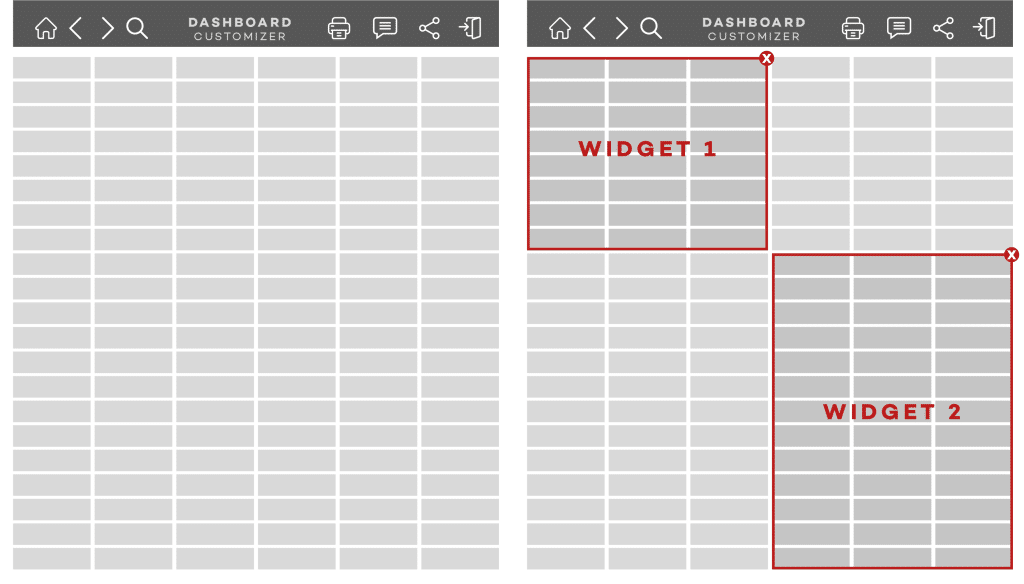
The technical implementation revolves around three elements: users, roles, and widgets. Users can activate different widgets to dive deeper into specific problems when needed, rather than being stuck with information that’s irrelevant to their current task.
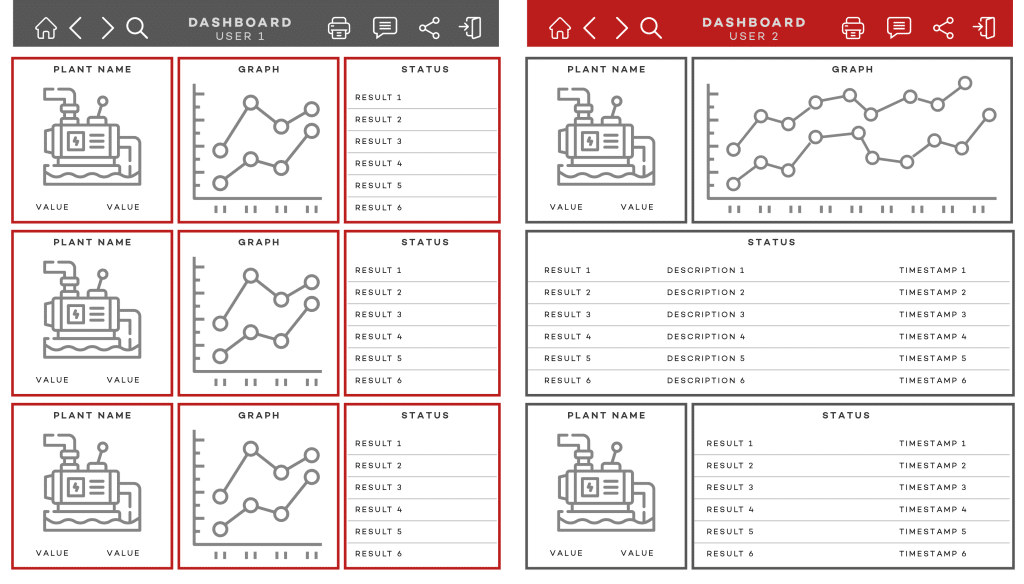
How it actually works: two views
If you’re an end user
You can arrange your dashboard however makes sense for your job. The widgets are pre-built but flexible—add, remove, resize, and move them around until you get a layout that actually helps you work.
Need to monitor production metrics? Drag the relevant widget into place and size it appropriately. Working on a specific problem? Activate additional widgets that show the detailed information you need, then remove them when you’re done.
The interface adapts to different screens and devices. You’re not locked into someone else’s idea of how information should be organised—you can set it up to match how you actually think and work.
If you’re the Developer/Admin
You get extensive configuration options while maintaining user flexibility. Design and configure widgets in the Designer, then make them available based on roles and responsibilities.
You control grid layouts, responsive settings, and widget properties through the Property Editor. Creating user-friendly dashboards is straightforward with drag-and-drop design, while role-based controls ensure sensitive information stays properly secured.
You can create both customisable sections (where users have full control) and fixed sections (where critical, role-dependent information must always appear). Need specific information available only to supervisors? Add the appropriate role restrictions to those widgets.
Solving the real problems
This dashboard approach directly addresses the three main obstacles:
Technology: Build solutions alongside existing systems. Ignition’s licensing lets you start small and expand gradually. Rather than being constrained by legacy systems, add Ignition to your current setup and start creating value immediately.
Tradition: Yes, users might initially be sceptical about interfaces that don’t look “like normal HMI.” But the productivity improvements consistently overcome resistance. When people can actually get their work done more easily, they adapt quickly—and they even ask for more (true story!).
Policies: The configurable nature handles compliance requirements through fixed sections for role-dependent widgets, while still giving users freedom to optimise their personal workflows. You can satisfy audit requirements and user needs simultaneously.
The bottom line
The Dashboard Component simplifies data management and visualisation, but more importantly, it recognises that humans are the ones consuming this information. Whether people have different or similar responsibilities, they can adjust their dashboards to match their individual needs, helping them make decisions and solve problems faster.
We’re not talking about fancy technology for its own sake. We’re finally building industrial interfaces that respect the fact that different people need different things, even when they’re doing similar jobs.
The technology exists. The benefits are proven. What we need now is the willingness to move beyond one-size-fits-all thinking and start treating users like the individuals they are.
Because here’s the truth: no matter how sophisticated our data collection becomes or how advanced our analytics grow, insights and decisions still come down to people.
In essence, the dashboard approach moves beyond the lip service of “our people are our biggest asset” and offers a true and genuine empowerment of the people handling the daily operations. They deserve interfaces as unique and capable as they are.