Our client is a large manufacturing company in Europe that aims to use data to improve their production, align with the changing regulations, and keep customers satisfied with high-quality, timely deliveries. That means minimal downtime.
An assessment of the digital state of the company revealed the need for automated data acquisition and analysis on the plant floor and throughout the organisation, the company chose Ignition as the platform for that and Enuda as the partner to bring the ecosystem together. The project started as a SCADA project, but new ideas and user stories have come into play.
Table of Contents
The goal: Downtime Reasons
Downtime means no money. Thus, when it happens, it should happen for a valid reason, and if it doesn’t, we should know why. As all manufacturers, our client needs to know what’s going on in order to further optimise the operations, reduce costs, and improve productivity.
The Downtime Reasons solution is designed to track and categorise downtime events. It aims to provide valuable insights into the most common reasons for downtime and their duration.
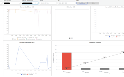
In this case study, we’ll present the Downtime Reasons dashboard, along with a Downtime Reasons Pareto Chart that lives as a widget on another dashboard with several KPIs.
The challenges
- Obsolete data management: Reliance on outdated proprietary solutions and manual data logging prevented efficient production analysis.
- Lack of insight: With no scalable infrastructure to connect machines and processes, the company struggled to gain insights into production.
- Data inconsistency: Operating across multiple sites without standardised data structures led to inefficiencies and difficulties in comparing performance metrics.
Essentially, they didn’t have insight into how the production was going in real-time, let alone into opportunities for improvement.
The solution
Project Management
The project started with selecting one specific production line for collecting data and creating the necessary dashboards. That approach is completely in line with our general recommendation of starting small and getting something specific in front of the users as fast as possible.
In this case study, two phases are particularly important:
- Laying the groundwork: First up, we created a scalable architecture to tackle connectivity issues, standardise data, and enhance cybersecurity.
- Building smart solutions: Next, we developed user-friendly dashboards and mobile solutions.
The tech

Key Features
Connectivity
The deliverables in this phase sounded like this:
- Establish Development/Test/Production environments
- Inserting Ignition licenses in the gateway
- Creating users/roles in Ignition
- Establish security on Ignition Projects
- Implement ISA 95 Data Model.
- Creating Tag Structure based on ISA-95
- Creating UDTs in the Tag Structure
- Enabling historisation for raw data
Each local architecture consists of a single Ignition Gateway connected to the OT networks and a single SQL database. Apart from the local architectural framework, we employ MQTT for connectivity with the headquarter and other sites, ensuring seamless data exchange within The Unified Namespace (UNS). Together with using PackTags from the PackML standard, this approach allows us to maintain a cohesive and standardised data environment across all facilities, promoting efficiency and scalability.
We follow the ISA-95 standard for creating a tag structure via the common data model Enterprise/Site/Area/Line/Cell. Whenever feasible, we aim to construct User-Defined Types (UDTs). This approach is in line with our commitment to The Unified Namespace (UNS), which helps streamline data management and integration across our systems and ensures consistency and coherence in our operations.
The dashboards
Backend
The data from the plant floor is organized in tags in Ignition following the PackML standard. This standard defines a set of tags used in packaging industry to represent the state and status of the machines for communication and control.
To efficiently capture downtime reasons, we’ve implemented a mechanism that listens for changes on the StateCurrent tag within our system. Whenever the state transitions to one of the following statuses: stopped, idle, suspended, or held, we automatically record a corresponding row in a designated database table. This stored data is later made available for user reference and analysis. In instances where the state transitions to “aborting,” we log “Emergency stop” as the reason for downtime.
Additionally, if there is an active alarm during any state, we record “Machine alarm” as the reason for downtime. These recorded downtime reasons serve as valuable data points for our Key Performance Indicators (KPIs), including the Pareto Chart.
Frontend
An overview of what is stored in the database is shown on the page Downtime Reasons, where highlighted rows indicate that a reason should be inserted by a user.

Downtime Reasons Interface
During row editing, the logged-in user has the opportunity to input a downtime reason, distinguishing between planned and unplanned occurrences.

Choose Downtime Category

Downtime Reason Input by User
On the Supervision page, a specific state triggers an overview of the logged downtime reasons, providing insights into the factors contributing to operational interruptions. This feature allows users to analyse and address both planned and unplanned downtime occurrences, facilitating informed decision-making and proactive management of system performance.
In this case, the user can compare the reasons and find which reasons last longer than others.

Overview of logged downtime reasons
Real-time Downtime Reasons
To efficiently store downtime reasons as they occur in real time, we’ve developed two separate versions tailored to different user interfaces.
The first version is designed to integrate seamlessly into the machine’s HMI (Human Machine Interface). In this version, users can input downtime reasons directly within the interface. The associated solution is opened by passing the machine as a URL parameter. This integration ensures that operators can quickly and conveniently log downtime reasons without disrupting their workflow.
In the following, the green buttons indicate that the state is not one of the down states, so we can’t insert a reason.

Example of user interface in machine HMI
The mobile version
The second version is optimised for mobile and tablet devices, offering users a responsive interface where they can select the site, area, line, and cell to view real-time states and input downtime reasons.
This mobile-friendly approach provides flexibility and accessibility, allowing users to log downtime reasons from anywhere within the facility. By offering these two distinct versions, we accommodate varying user needs and preferences while ensuring timely and accurate logging of downtime events across different platforms and devices.
The tablet and mobile versions of our downtime logging system use a cascading approach for selecting elements, enhancing user experience and accessibility on smaller screens. This cascading design organizes elements hierarchically, starting with broader categories such as site and area, and progressively narrowing down to more specific options like line and cell.

Mobile User Interface
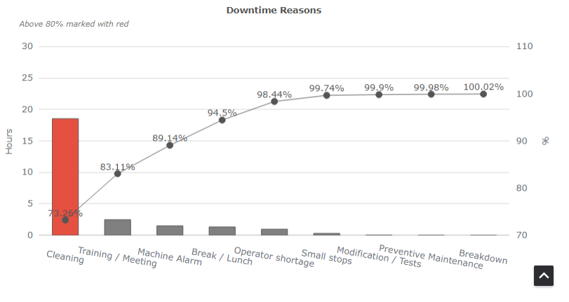
Downtime Reasons Pareto Chart
The incorporation of a Pareto Chart as a widget in the MES KPI dashboard serves as a strategic decision to enhance the downtime analysis capabilities.
The Pareto Chart systematically visualises and prioritises the most significant downtime reasons by displaying them in descending order of occurrence. This widget provides a concise and graphical representation, enabling quick identification of the primary contributors to downtime events.
By focusing on the vital few rather than the trivial many, the Pareto Chart empowers decision-makers to allocate resources efficiently, addressing the root causes that have the most substantial impact on overall system performance. The Pareto Chart essentially consists of two primary components: bars representing individual categories and a line graph depicting cumulative frequency or percentage. It follows the Pareto Principle, also known as the 80/20 rule, which suggests that roughly 80% of effects stem from 20% of causes.
The outcomes
- Standardisation and scalability: we’ve successfully developed a system where data is consistent and efficiently managed, thanks to MQTT for connectivity and following the ISA-95 guidelines for data organisation. This ensures a smooth and reliable flow of information throughout the Unified Namespace (UNS). It’s a practical approach that not only improves current operations but also sets a solid foundation for future expansion and integration, keeping us ready for whatever comes next.
- Insightful data analysis for strategic decisions: the introduction of the Downtime Reasons dashboard and Pareto Chart provides valuable insights into the primary causes of downtime. They can allocate resources more effectively and prioritise maintenance and improvements in areas that have the most significant impact. By concentrating on the most critical issues first, their efforts are more targeted and drive better results, streamlining their processes and enhancing productivity.
- Enhanced operational efficiency: monitoring downtime reasons as they occur has significantly improved the ability to quickly identify and address the root causes of production interruptions.
What’s next?
With this solution in place, the people responsible for the daily operations embark on a journey of continuous improvement. That is the essence of digital transformation: empower people to work smarter and improve the processes they’re in charge of.
Moreover, creativity flows when problems are solved. The responsible team on this client’s side is one of the most enthusiastic and creative we’ve met—the more pain points are gone, the more ideas they generate for smarter, faster analysis. Aside from improving on the current solution, we dive into other KPIs that will show stakeholders actionable information and make the operators’ lives easier.
Lessons Learned
Build a solid foundation first
Having a strong digital base is key if you want to make the most of real-time data and get those SCADA and MES systems up and running smoothly. Think of Ignition as the go-to spot for all your data: it sorts everything out so you can easily grab what you need and put it to work in a functionality.
Flexibility and accessibility matter
When we rolled out two flavors of our downtime logging tool—one for desktop and one for mobile and tablet—we highlighted how important it is for tech solutions to be flexible and easy for everyone to use. This way, no matter where you are in the building or what device you’ve got in hand, logging downtime is available to you.
Start small
One thing we’ve learned is that starting by focusing on just one production line for gathering data and setting up dashboards can really make a difference. This isn’t just about keeping things simple at the beginning—it’s about making sure we can get things moving quickly and start seeing benefits right away. It’s a solid reminder that when you’re tackling big, complex projects, kicking things off with a manageable chunk can help you learn as you go and build up to even better, more long-lasting solutions.